
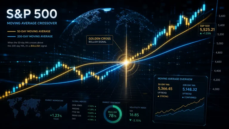
For any fund research analyst, navigating the cross-currents of market volatility requires a robust, data-driven framework. My work centers on filtering out short-term market noise to identify durable, long-term trends.
This is precisely why a core component of my toolkit involves using moving averages to track macroeconomic trends in the S&P 500. This methodology provides a vital bridge between price action and the broader economic narrative.
By linking macroeconomic indicators to MA signals and formulating strategies for identifying trends with moving averages, we can move beyond reactive trading and toward a more informed, strategic allocation of capital.
It’s about quantifying market sentiment and aligning it with fundamental economic health.
Understanding Moving Averages as a Market Indicator
Pro Tip: Moving Averages (MAs) are not predictive; they are lagging indicators that smooth out price data to reveal the underlying trend’s direction and strength. For S&P 500 analysis, the Exponential Moving Average (EMA) often provides a more responsive signal than the Simple Moving Average (SMA) by placing greater weight on recent price action, which is crucial for identifying potential shifts in market structure influenced by macroeconomic data releases.
At their core, moving averages are a statistical tool used to analyse data points by creating a constantly updated average price.
This smoothing effect helps to cut through the daily ‘noise’ of the market, offering a clearer perspective on whether an asset is in an uptrend, downtrend, or moving sideways. For a broad market index like the S&P 500, this is invaluable for gauging the sentiment of institutional capital.
What are Simple (SMA) and Exponential (EMA) Moving Averages?
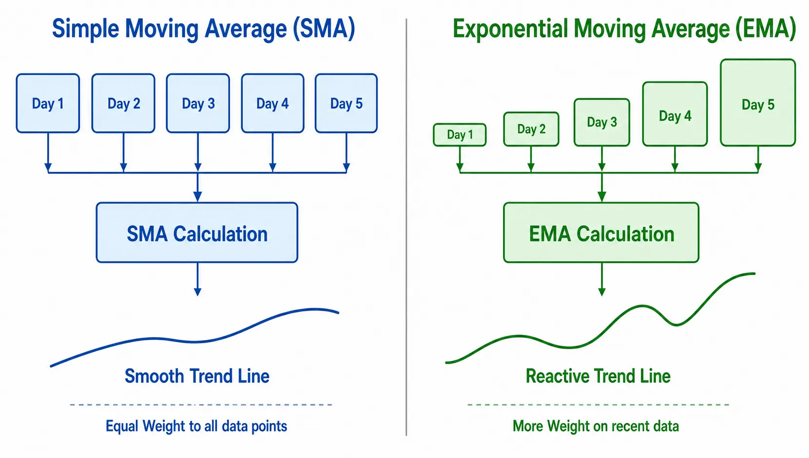
The two most common types of moving averages are the Simple Moving Average (SMA) and the Exponential Moving Average (EMA). The primary difference lies in their calculation and, consequently, their responsiveness to new information.
- Simple Moving Average (SMA): The SMA is the most straightforward type. If you are calculating a 50-day SMA, you sum up the closing prices of the last 50 days and divide by 50. Each data point in the period is given equal weight. This results in a very smooth line, but it can be slow to react to abrupt changes in price or macroeconomic conditions.
- Exponential Moving Average (EMA): The EMA gives more weight to the most recent prices in the calculation. This makes it more sensitive to recent price movements and new information. For analysts tracking the impact of, say, a sudden inflation report on the S&P 500, the EMA will reflect that shift more quickly than the SMA.
| Feature | Simple Moving Average (SMA) | Exponential Moving Average (EMA) |
|---|---|---|
| Calculation | Average of prices over a set period, with equal weighting. | Weighted average, giving more significance to recent prices. |
| Responsiveness | Slower to react to new price information. | Faster to react, making it more sensitive to trend changes. |
| Best Use Case | Confirming long-term, established trends. Good for identifying major support/resistance. | Identifying short-term trend shifts and entry/exit signals. |
| Signal Reliability | Fewer false signals due to its slower nature. | Can produce more ‘whipsaws’ or false signals in volatile markets. |
Why the 200-Day Moving Average is a Key Benchmark for the S&P 500
In the world of institutional analysis, the 200-day moving average is the definitive line in the sand for determining the long-term health of the market. It represents approximately 40 weeks of trading and is watched by virtually every fund manager, analyst, and automated trading system.
When the S&P 500 is trading above its 200-day MA, it is broadly considered to be in a healthy, long-term uptrend (a ‘bull market’). Conversely, a sustained period below the 200-day MA is the classic definition of a ‘bear market’.
This indicator’s power comes from its widespread adoption; because so many market participants watch it, their collective actions reinforce its significance as a self-fulfilling prophecy for support and resistance.
Connecting Moving Averages to Key Macroeconomic Trends
How Inflation and Interest Rate Changes Affect S&P 500 Moving Averages
Macroeconomic forces, particularly monetary policy, are the primary drivers of long-term market trends. A change in the trajectory of interest rates or inflation expectations can fundamentally alter the valuation of the companies within the S&P 500.
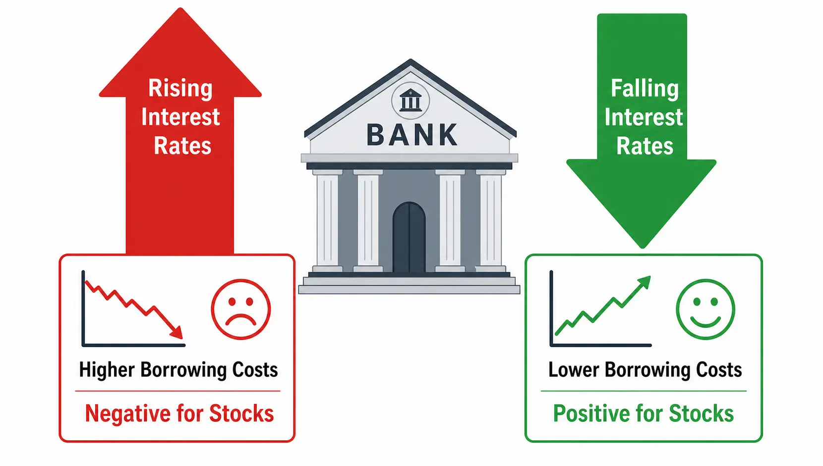
- Rising Interest Rates & Inflation: Typically, when central banks like the Federal Reserve raise interest rates to combat inflation, it increases borrowing costs for corporations and can slow economic growth. This makes future corporate earnings less valuable in today’s dollars (a higher discount rate), putting downward pressure on stock prices. On a chart, this can manifest as the S&P 500 struggling to stay above its 200-day MA, or decisively breaking below it.
- Falling Interest Rates & Quantitative Easing: Conversely, when central banks lower rates or inject liquidity into the financial system, it lowers borrowing costs and stimulates economic activity. This often leads to higher stock valuations and can propel the S&P 500 upwards, causing it to trade well above its long-term moving averages.
Using GDP Growth and Employment Data to Contextualize MA Signals
While interest rates are critical, other data points provide colour and context to the moving average picture.
Strong GDP growth and low unemployment figures typically correspond with rising corporate profits and positive investor sentiment, which helps to support the S&P 500 above key moving averages.
If the index is breaking below its 200-day MA at the same time that employment data is weakening and GDP forecasts are being revised downwards, it gives an analyst much higher conviction that the downtrend is fundamentally justified and likely to persist.
Practical Strategies for S&P 500 Trend Analysis
Pro Tip: Combine moving average signals with other indicators. A ‘Death Cross’ on its own can sometimes be a false signal. However, a Death Cross that occurs with high trading volume, negative market breadth (more stocks declining than advancing), and a hawkish shift in central bank tone is a high-conviction signal for risk reduction.
Identifying Long-Term Trends with the Golden Cross and Death Cross
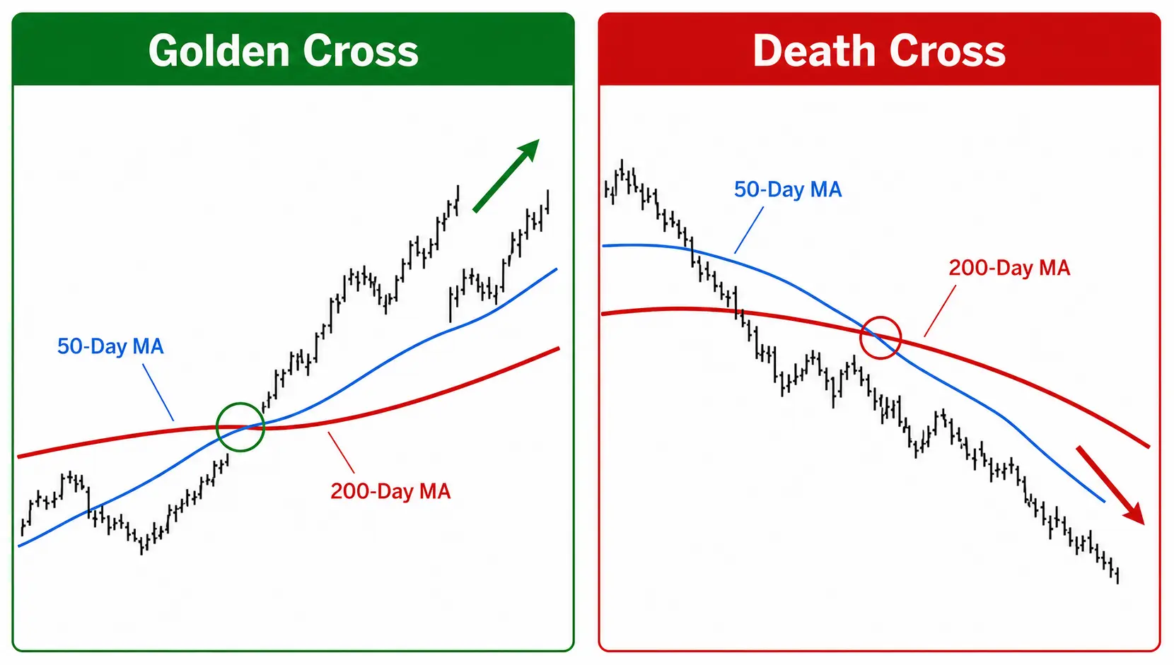
These are two of the most widely cited signals in technical analysis, generated by the interplay between a short-term and a long-term moving average, typically the 50-day and 200-day MAs.
- The Golden Cross: This occurs when the 50-day moving average crosses above the 200-day moving average. From a fund analyst’s perspective, this is a statistically significant event suggesting that shorter-term momentum is turning positive and has the strength to shift the long-term trend. It’s often interpreted as the beginning of a sustained bull market.
- The Death Cross: This is the opposite and more ominous signal. It occurs when the 50-day MA crosses below the 200-day MA. This indicates that short-term momentum is negative and is now dragging the long-term trend down. It is a classic signal of a potential bear market or significant market correction.
Using Shorter-Term MAs to Spot Potential Reversals
While the 50- and 200-day MAs are for long-term trend identification, shorter-term averages like the 10-day and 20-day EMA are useful for tactical adjustments.
In a confirmed uptrend (with the S&P 500 above its 200-day MA), a pullback to the 20-day or 50-day EMA can represent a buying opportunity—a point of dynamic support.
A decisive break below these shorter-term MAs can serve as an early warning that the prevailing trend is losing momentum and a deeper correction may be imminent.
| Strategy / Signal | Moving Averages Used | Interpretation | Analytical Value |
|---|---|---|---|
| Golden Cross | 50-day MA crosses above 200-day MA | Potential start of a long-term uptrend (Bullish) | Confirms shift from negative/neutral to positive long-term sentiment. |
| Death Cross | 50-day MA crosses below 200-day MA | Potential start of a long-term downtrend (Bearish) | Confirms shift from positive/neutral to negative long-term sentiment. |
| Dynamic Support | Price pulls back to the 50-day or 200-day MA in an uptrend | Potential buying opportunity / trend continuation | Identifies areas where buyers are likely to step in, based on trend strength. |
| Trend Momentum | Price consistently above 20-day EMA | Strong, short-term uptrend momentum | Gauges the intensity of the current market move and signals potential exhaustion. |
Frequently Asked Questions
1. Is it better to use an Exponential Moving Average (EMA) or a Simple Moving Average (SMA) for S&P 500 analysis?
From an analyst’s viewpoint, there is no single ‘better’ average; they serve different purposes. I use the 200-day SMA as the definitive long-term trend indicator due to its widespread acceptance.
However, for analysing the impact of recent macroeconomic news or for identifying shorter-term shifts in momentum, I find the 20-, 50-, and 100-day EMAs more valuable due to their responsiveness. A pragmatic approach uses both in conjunction.
2. What is a ‘Golden Cross’ or ‘Death Cross’ and what does it mean for the S&P 500?
A Golden Cross (50-day MA crossing above the 200-day MA) is a statistically significant indicator that suggests a shift to a long-term bullish market structure. A Death Cross (50-day MA crossing below the 200-day MA) suggests the opposite—a bearish shift.
While they are powerful, they are lagging indicators. They don’t predict tops or bottoms, but rather confirm that a substantial shift in the market’s underlying trend and its perception of the economic outlook has likely already occurred.
3. How do I add moving averages to an S&P 500 chart?
Virtually all modern financial charting platforms (like Bloomberg Terminal, Refinitiv Eikon, or even widely available platforms like TradingView) allow you to overlay technical indicators.
You would typically find the ‘Indicators’ menu, search for ‘Moving Average’, and then you can add it to your chart. The platform will allow you to specify the period (e.g., 50, 200) and the type (Simple or Exponential).
William Lee’s Final Thoughts
Sources & Methodology
William Lee strictly relies on primary regulatory data and authoritative official information to ensure accuracy. Data cited in this guide is sourced from:
*Disclaimer: The content of this article represents the personal views of the author (William Lee) and is for educational and reference purposes only. It does not constitute professional investment or financial advice. Trading and investing involve significant risk; proceed with caution.*
